
Let's start with what it isn't
When a company tells us it wants to “do the corporate identity”, it almost always means a new logo. And the logo is the most visible part and the least important. A corporate identity is everything that makes someone recognise your company without reading the name: the way the phone gets answered, the colour of the vans, how the person delivering the order is dressed, which photos appear on the website, how a sales email opens. The logo sits on top of all that. If what's underneath doesn't exist, the logo is a sticker.
It isn't the corporate image either, although the two get used as synonyms. The identity is what you decide; the image is what people perceive. The job of a branding agency is to shorten the distance between the two.
The elements: the ones you see and the ones you hear
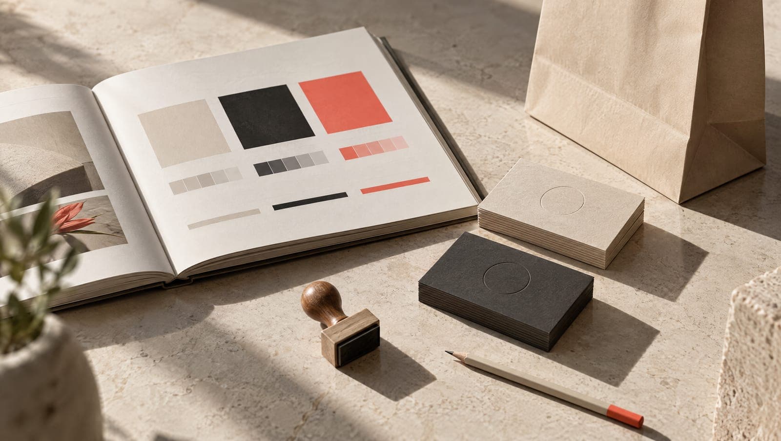
What you see is what everyone lists: name, symbol, logo and its versions, colours, typefaces, graphic system, photographic and illustration style. It's the part that fits into a document, which is why it's usually the only part that gets documented.
What you hear counts just as much and hardly ever gets written down: the tone. Whether the company is formal or informal. Which words it uses and which it avoids. How it apologises when an order is late. What a WhatsApp message from the sales rep sounds like. The day-to-day of a brand is a thousand emails and three adverts, and most manuals give fifty pages to the adverts and none to the emails.
And there's a third layer that is neither visual nor verbal: the way of doing things. If you promise short lead times, the identity breaks with every delay however handsome the logo is. It isn't something you design, but it is something you take into account: we don't propose an identity that promises what the company can't deliver.
The manual: what it's for and why most go unused
A corporate identity manual has one job: to let anyone, inside or outside the company, make a new piece without inventing rules or asking. The designer at the printer's, the sales rep putting a presentation together, the nephew who runs the Instagram account. If they have to ring up to find out which colour to use, the manual has failed.
And most of them fail for the same reason. They're made for the day of the handover, not for the Monday after. They're long, they talk about “values” and “essence” for twenty pages and, by the time you reach the useful part, the pieces made every week are exactly what's missing: the email signature, the quote template, the product label. Our view, plainly: if a manual can't be read in an afternoon and doesn't include templates, it's a design document, not a working tool.
What a manual people actually use has to have
The list we follow, and the reasoning behind each point:
- The logo in all its versions (horizontal, vertical, symbol alone, reversed, single colour) and, more importantly, how not to use it, with examples of what has already been done wrong inside the company.
- Colours with codes for screen and print, and a simple rule of proportion: which one dominates, which one accompanies, which one is only for details.
- Typefaces licensed in the company's name and a free alternative for when the file lands on a computer that doesn't have them. If the manual demands a typeface nobody can install, people will use whatever comes as standard.
- Photography: what gets shown, in what light, what gets avoided. With real photos of the company as the example, not stock images nobody will be able to match.
- Tone of voice with examples: three written emails, a reply to a complaint, a text for social media. Adjectives (“approachable”, “professional”) are no use when you sit down to write; examples are.
- Templates for what gets made every week: presentation, quote, email signature, social media post, label, poster. Editable and in the software the company uses, not the one the designer uses.
- Someone in charge: who decides when a question comes up that the manual doesn't cover.
All of that fits into a short document. Whatever doesn't fit is left out on purpose.
A worked example: from the manual to the van
A manual gets tested on real content before it's handed over. Take an industrial manufacturer with a product catalogue, a sales presentation, spec sheets and a small fleet of vehicles. The system has to hold up under:
- The catalogue: long product names, tables with a lot of columns, technical photos next to room shots. If the chosen typeface has no condensed version that reads properly in a table, the catalogue will be made with a different one and the manual becomes waste paper.
- The sales presentation: it gets projected in rooms with bad light. A corporate colour that looks beautiful on screen can disappear through a projector. Test it.
- The spec sheet: engineering makes it, not marketing. It needs a template in the software they use and a clear rule about what is compulsory and what isn't.
- The vehicle livery: it's seen from thirty metres away and moving. The symbol has to work on its own, without the name, and the phone number has to be readable from another car.
When the system passes those four tests, it works everywhere else. When it doesn't, better to find out before printing a thousand catalogues.
Photography is part of the identity
You can have the best graphic system going and lose all of it with a stock photo on the front page of the website. People recognise those images instantly, and what they recognise is that the company has no photos of its own. That's why we include photographic direction inside the identity project: we define how the company is looked at and run a first session at its premises, with its people and its product. What comes out is an image library of its own that marketing, sales and whoever runs the social accounts can use without asking permission for years. When that identity reaches the website, photography is what makes a web design page look like it belongs to that company and not to a template.
When to review the identity (and when to leave it alone)
It's time to review it when it says something that is no longer true: you've changed market, size or the generation in charge and the image is still in the previous chapter. It's time when the team loses hours fighting with files that don't fit. And it's time when you feel awkward showing people the website.
It isn't time out of boredom or because a competitor has changed theirs. A company with history has an asset a new brand doesn't, the people who recognise it, and refreshing it is surgery, not demolition. How that's done without losing the customers you've had for years is what we cover in another article.